Project Overview
The challenge of this project is to develop a data visualization tool that transforms personal data into a meaningful and useful format. This dashboard focuses on helping users explore how caffeine influences their daily routines, specifically tracking patterns in focus, productivity, mood, and sleep. By visualizing these areas, the tool enables users to make informed choices that support their well-being and performance, fostering self-awareness and empowering them to adjust habits for improved health and productivity.
Problem
It’s challenging to understand the effects of caffeine consumption on focus, mood, productivity, and sleep, which makes it harder to optimise daily routines for improved well-being.
Problem Frame
How might users identify and understand patterns in caffeine’s impact on their daily routines, allowing them to make informed choices for better productivity and health?
Solution
An interactive data visualisation dashboard that tracks and visualises caffeine’s influence on focus, mood, productivity, and sleep, helping users gain insights into their habits and make adjustments to enhance their daily lives.
Research
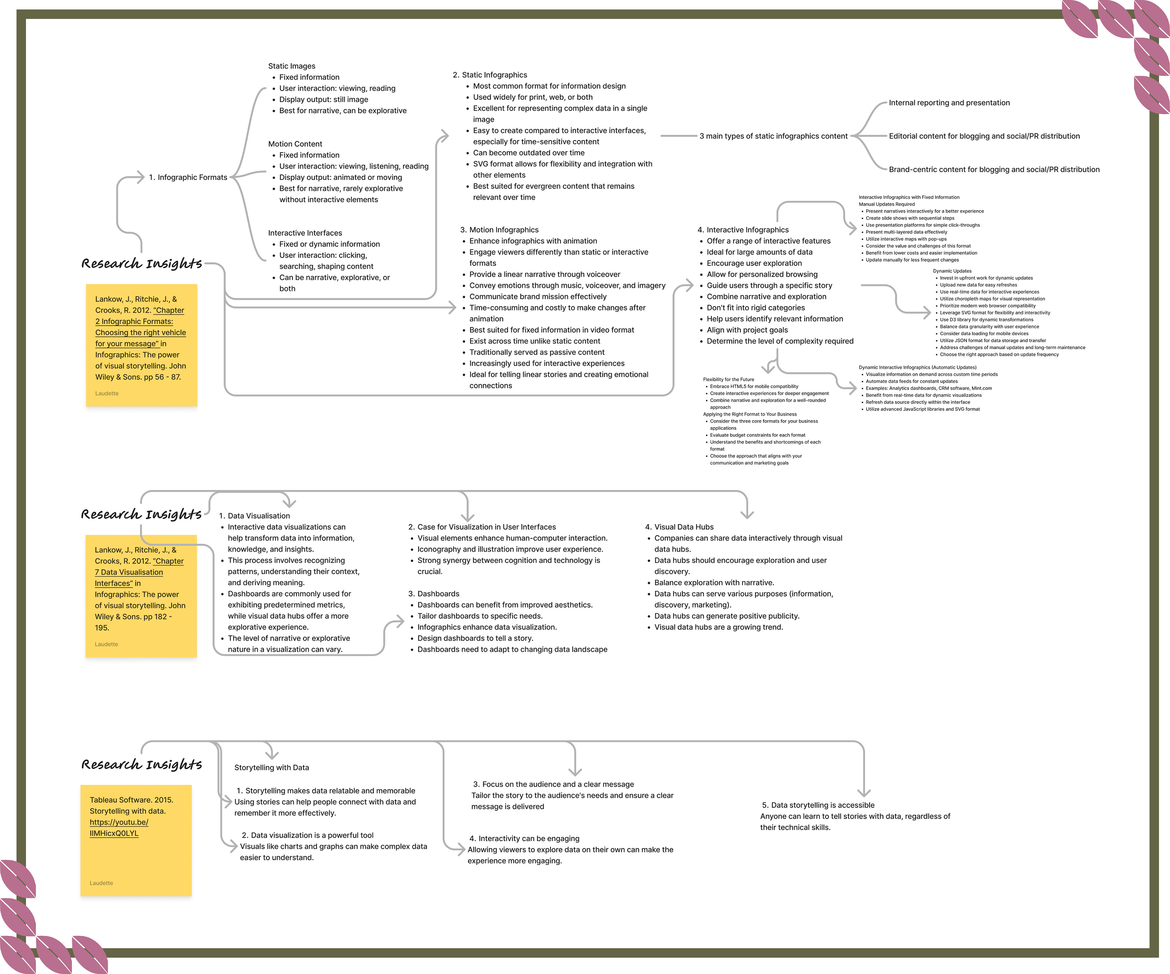
Research Insights
Users prefer engaging, interactive dashboards that simplify data, encourage exploration, and tell a clear story. Static, motion, and interactive infographics each suit different data needs and update frequencies. Real-time, dynamic dashboards allow for ongoing insights, enhancing user experience by making data memorable and easy to connect with through visual storytelling.
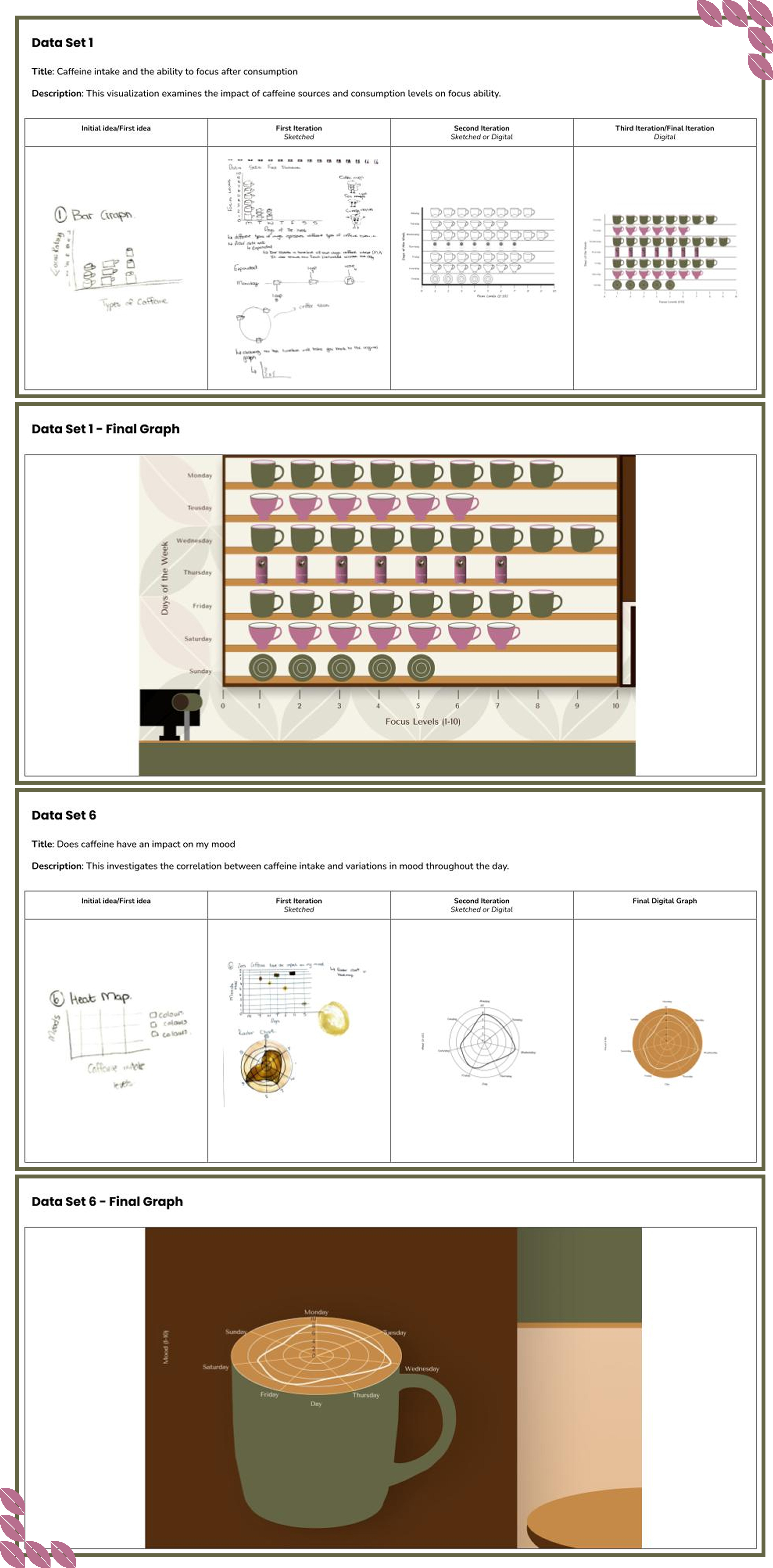
Data Curation
Curating data for the Brewed Insights dashboard involved selecting metrics on caffeine consumption, focus, productivity, mood, and sleep. This process ensured the information was relevant to user goals. Data curation helped identify trends and patterns, guiding the design of visualisations that communicate insights. Organising data into accessible formats enabled the development of interactive elements that support user exploration and understanding, contributing to a focused design solution.
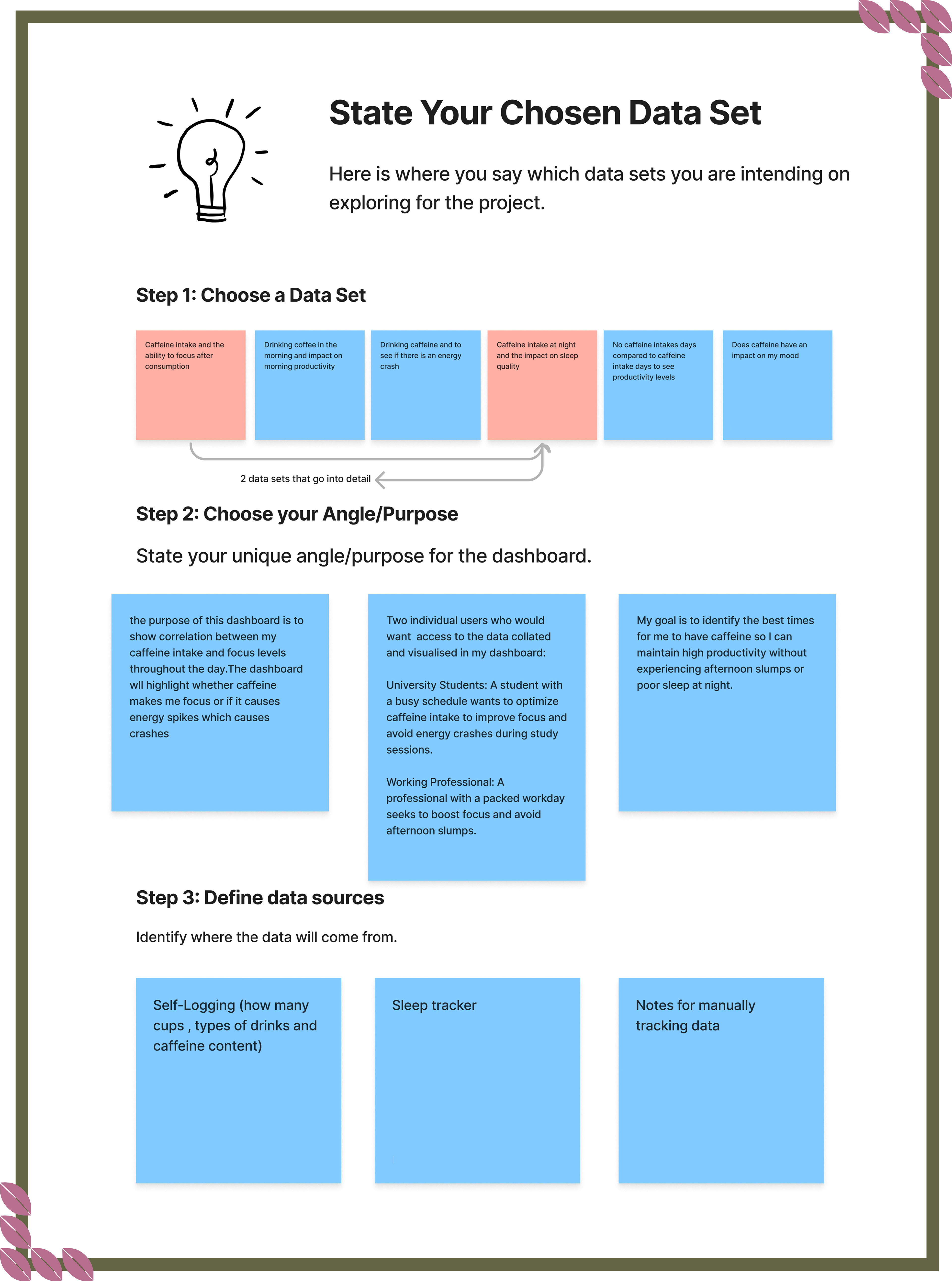
Data Iterations
Data iterations refined the metrics for caffeine consumption, focus, productivity, mood, and sleep. User feedback informed adjustments to visualisations and interaction features. Each iteration aimed to improve functionality and user experience, ensuring the final design effectively communicates insights.
Sketches
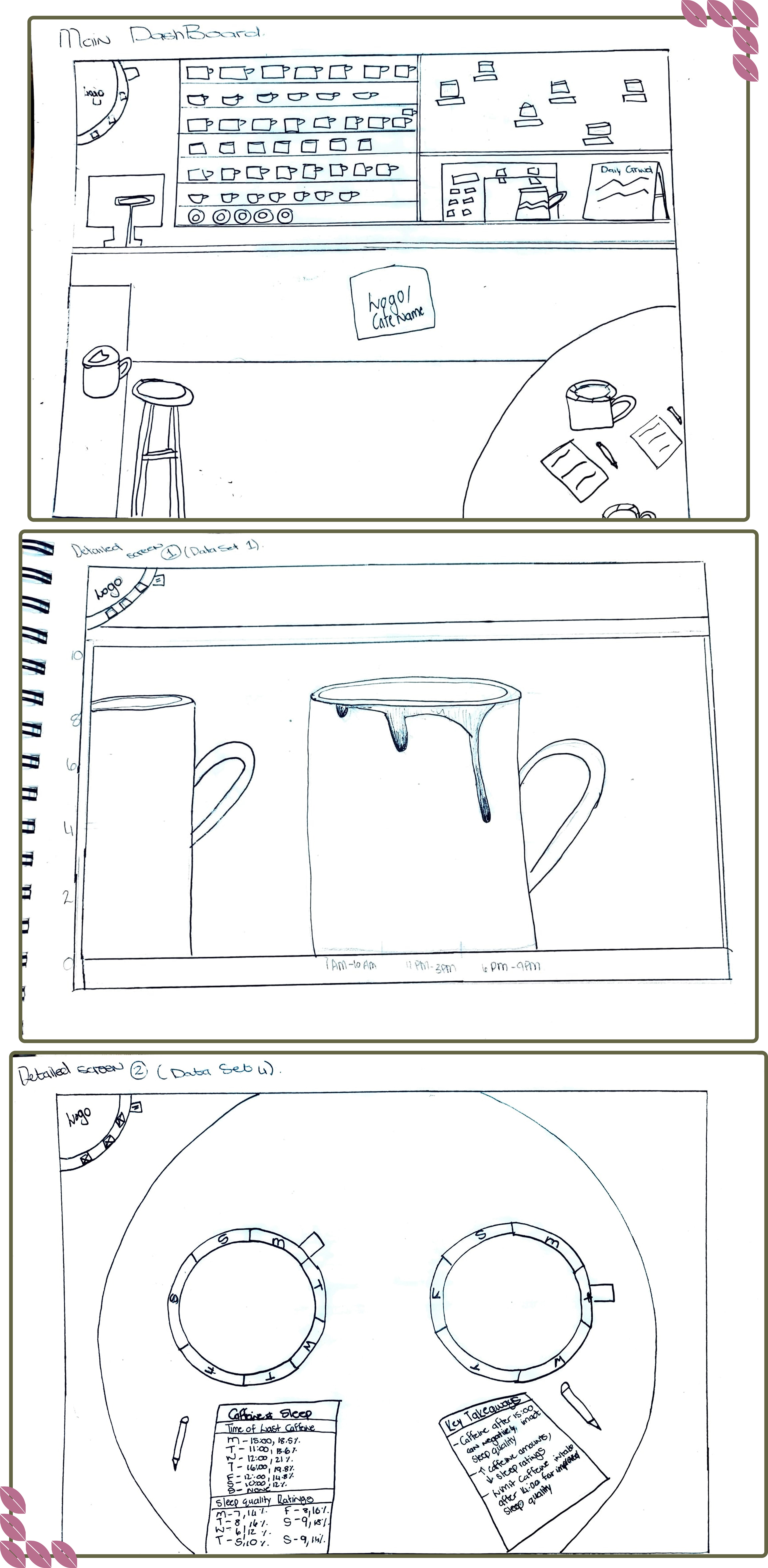
Creating sketched wireframes for the Brewed Insights dashboard provided a framework to conceptualise the layout and features. This step clarified design decisions regarding data visualisations and navigation elements. The sketches enabled discussions about user interaction and experience, allowing for adjustments based on feedback. This process led to a final design that meets user needs and improves engagement with the dashboard.
Annotated Wireframes
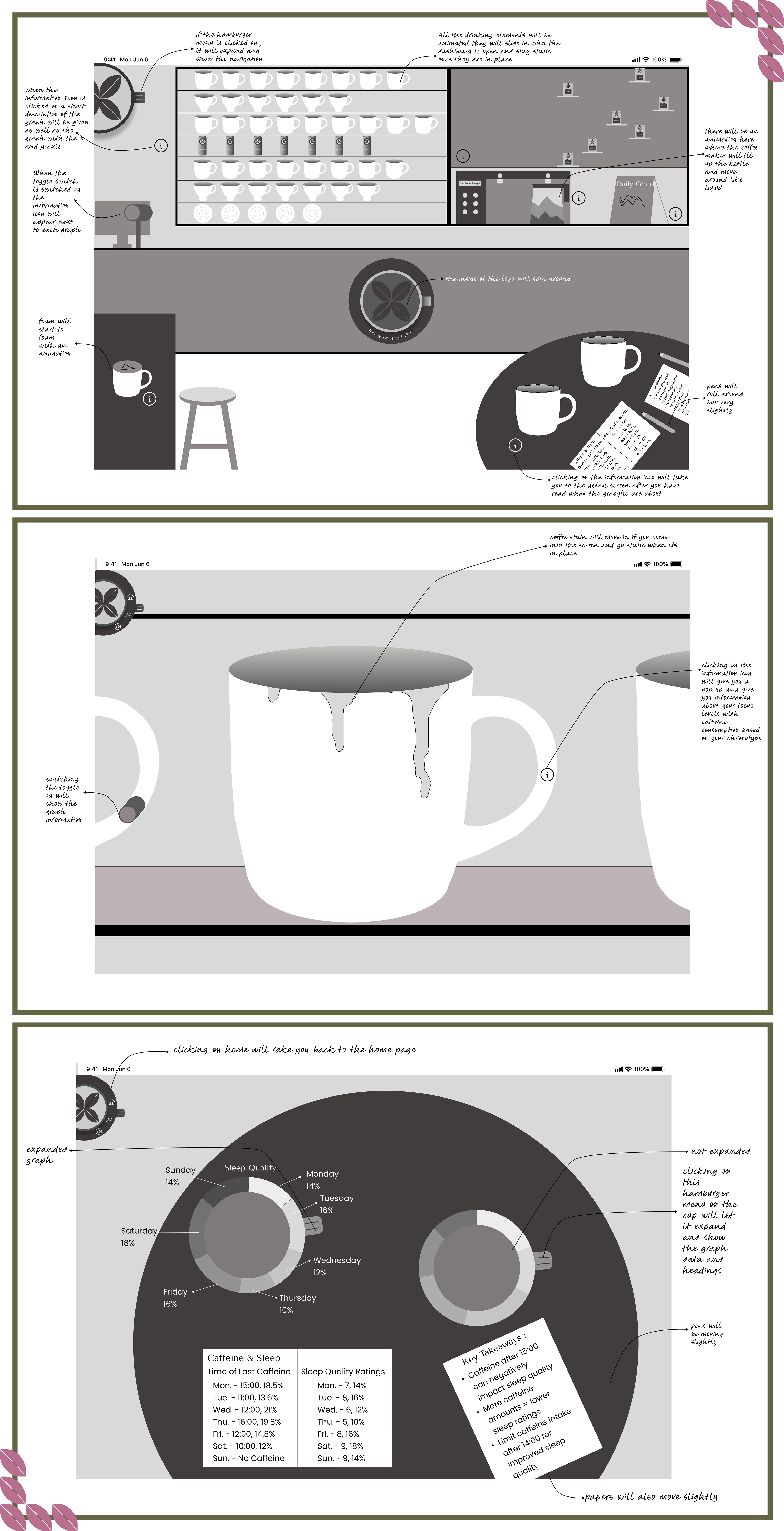
Annotated wireframes for the Brewed Insights dashboard outlined specific functionalities and interactions for each element. This step detailed the purpose of visual components and user actions, ensuring clarity in design intentions. This process helped refine the dashboard to effectively support user interactions and data exploration.
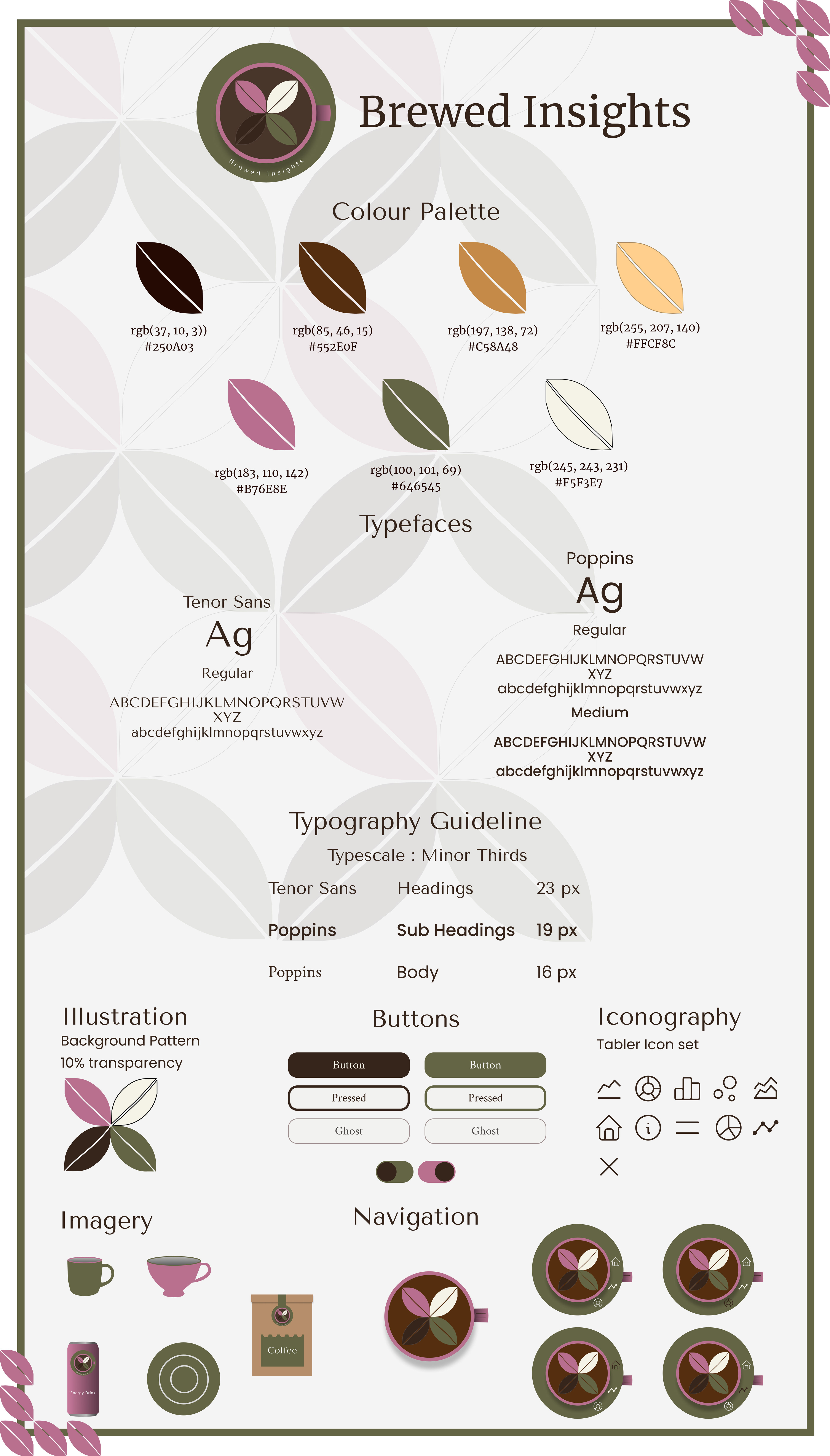
Style Tile
Developing the style tile for the Brewed Insights dashboard defined the visual elements and branding. This step sets guidelines for colours, typography, and visual components, ensuring consistency across the dashboard. The style tile served as a reference for design choices and helped maintain a cohesive user experience.
Visual Interface Design
Dashboard
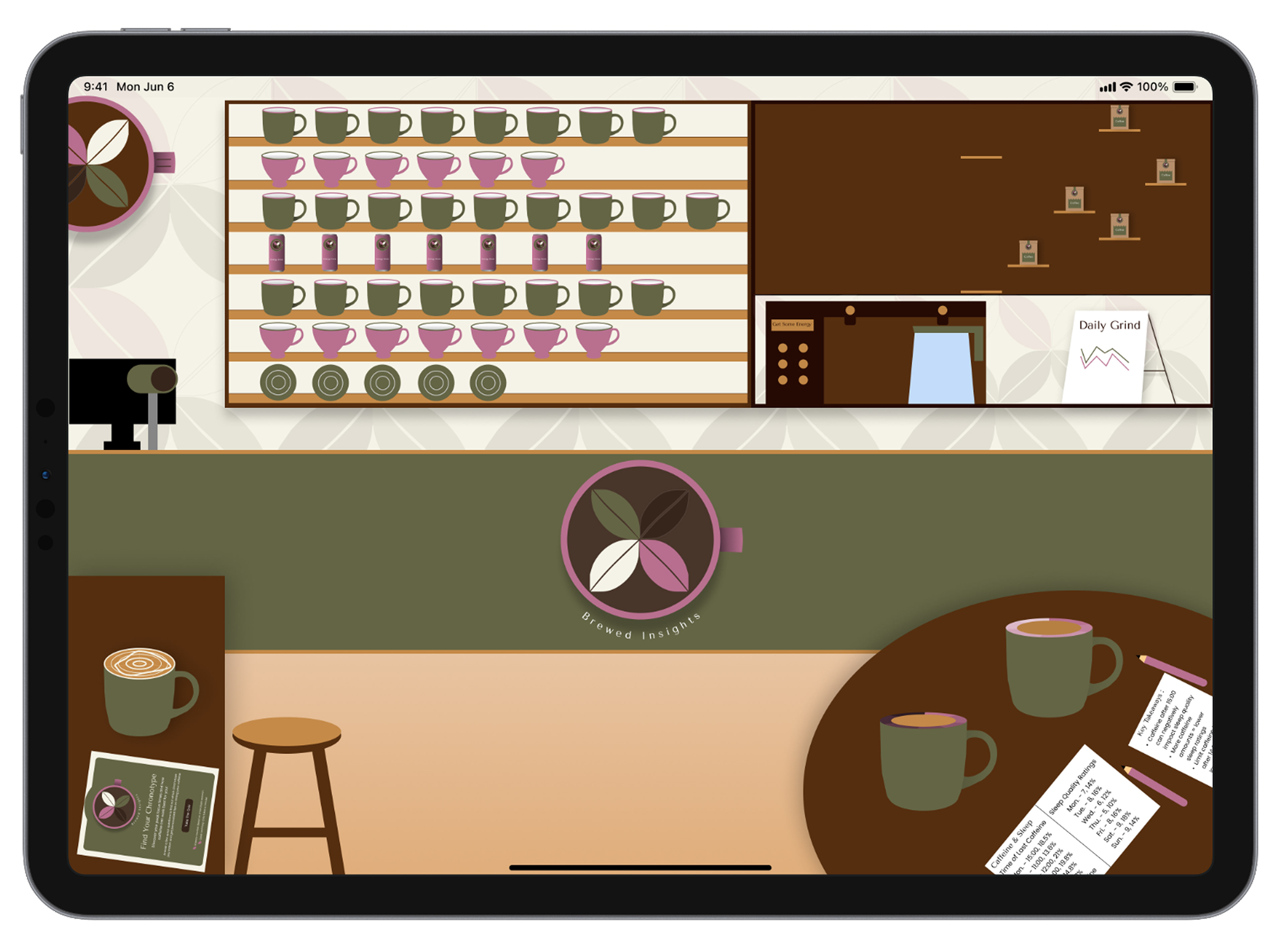
The Brewed Insights dashboard addresses the challenge of understanding caffeine's effects on focus, mood, productivity, and sleep. The café-themed layout integrates charts for easy data exploration. A toggle switch reveals detailed views of each graph, while a collapsible menu bar allows for simple navigation. These features create an intuitive interface that helps users analyse caffeine consumption and its impact on daily routines.
The Brewed Insights dashboard addresses the challenge of understanding caffeine's effects on focus, mood, productivity, and sleep. The café-themed layout integrates charts for easy data exploration. A toggle switch reveals detailed views of each graph, while a collapsible menu bar allows for simple navigation. These features create an intuitive interface that helps users analyse caffeine consumption and its impact on daily routines.
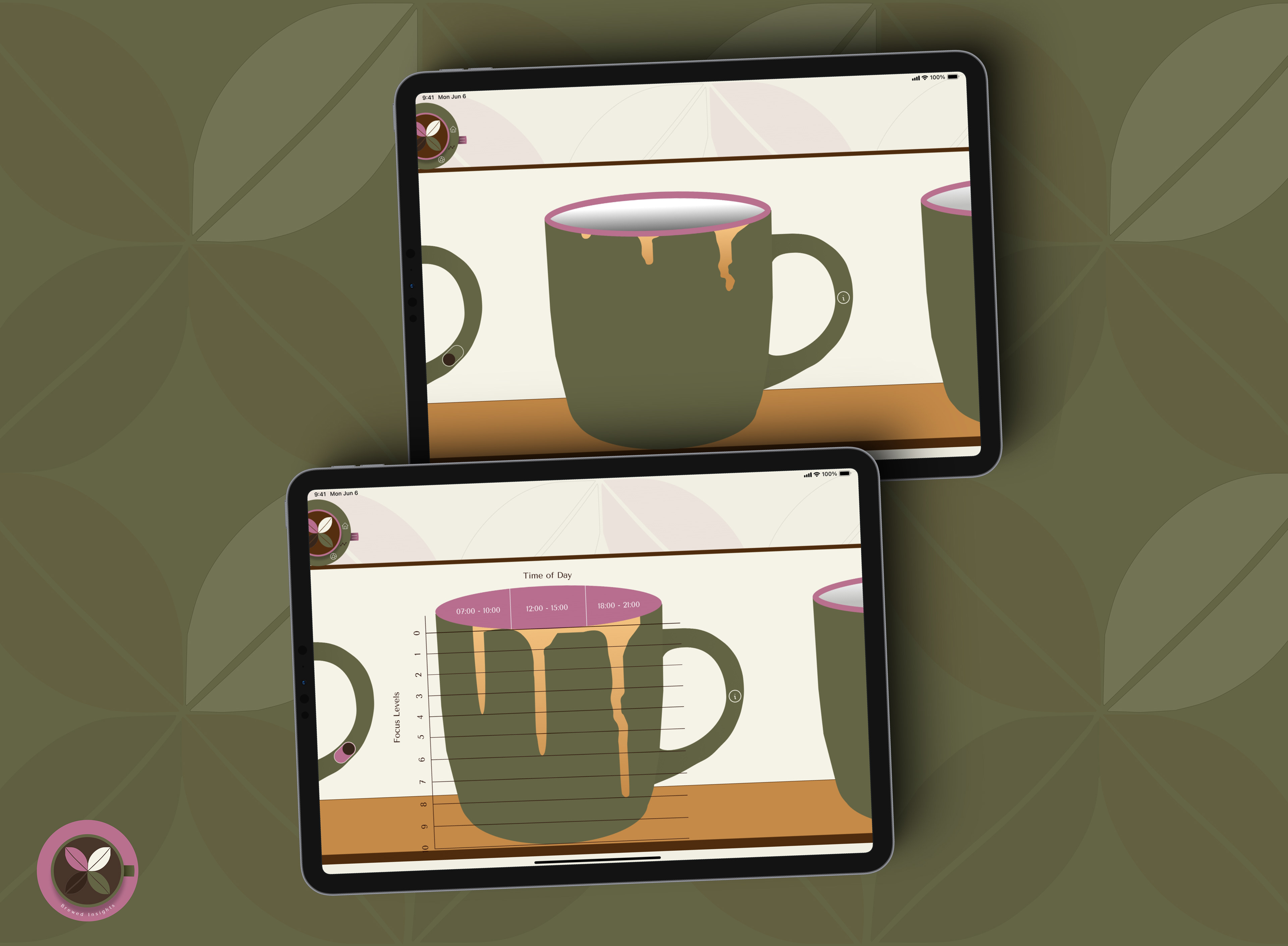
Detailed Screen 1
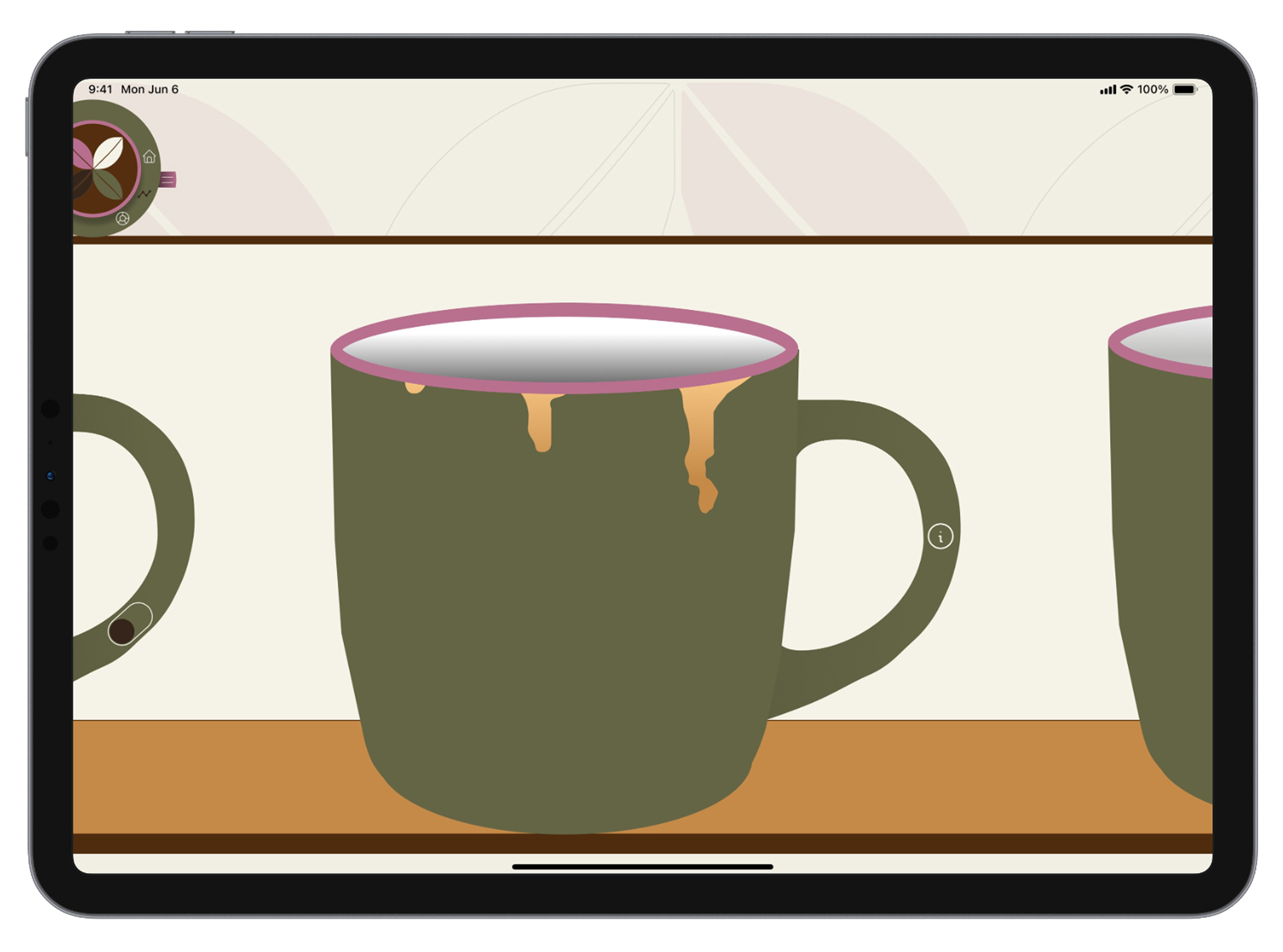
The first detailed screen examines focus levels related to caffeine timing for Monday. It visualises the connection between caffeine intake and focus fluctuations, helping users identify patterns. A chronotype section provides personalised recommendations for optimal caffeine timing, accessible via an info icon. A toggle switch enables an interactive view of the focus and caffeine timing graph.
Detailed Screen 2
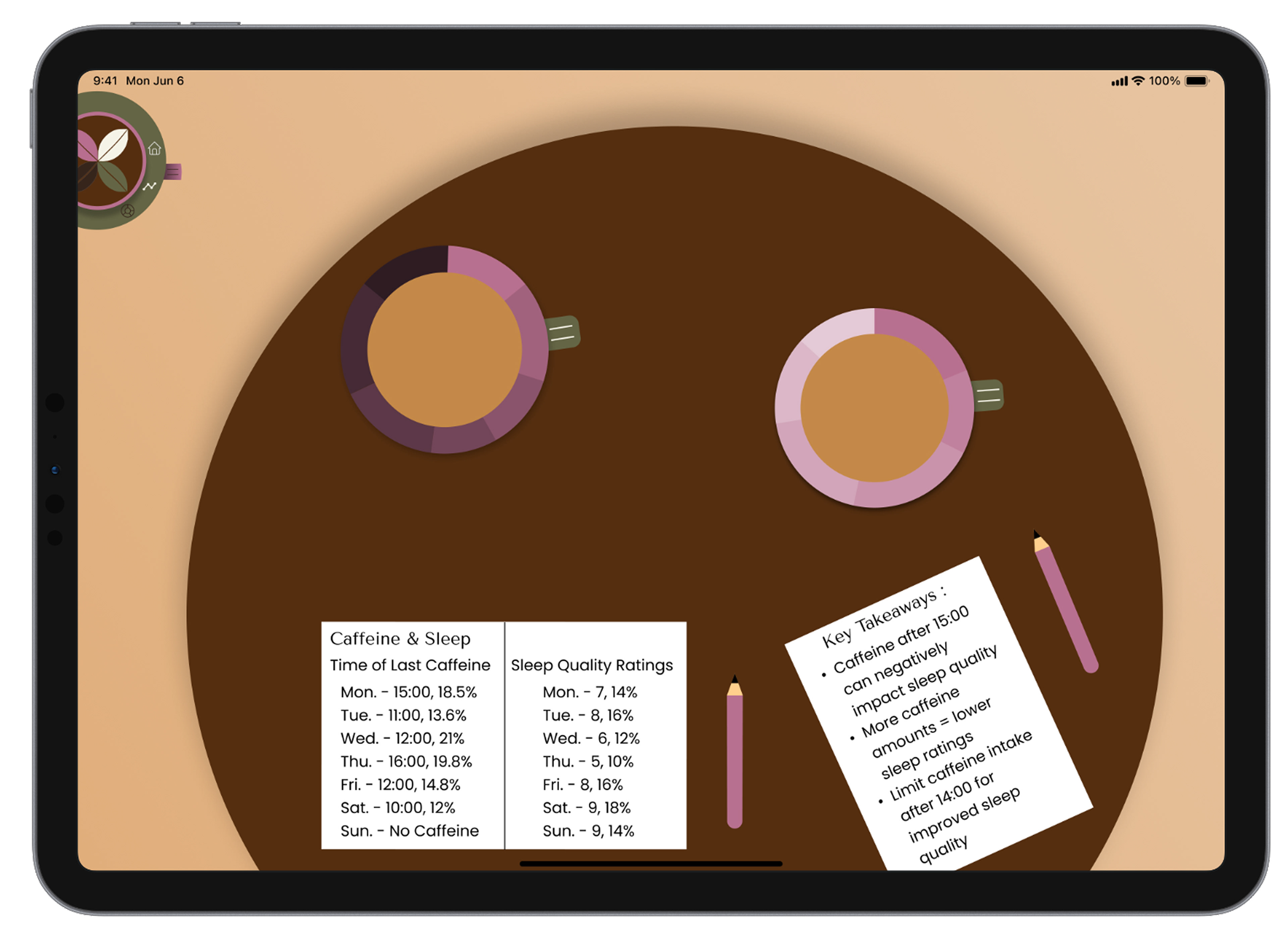
The second detailed screen examines sleep quality, and the last examines caffeine intake timing. A doughnut graph on the left displays sleep quality, with a menu bar for percentages and the title. Next to it, another graph shows the last caffeine intake timing, also with a menu bar. Key takeaways below summarise insights from the data.
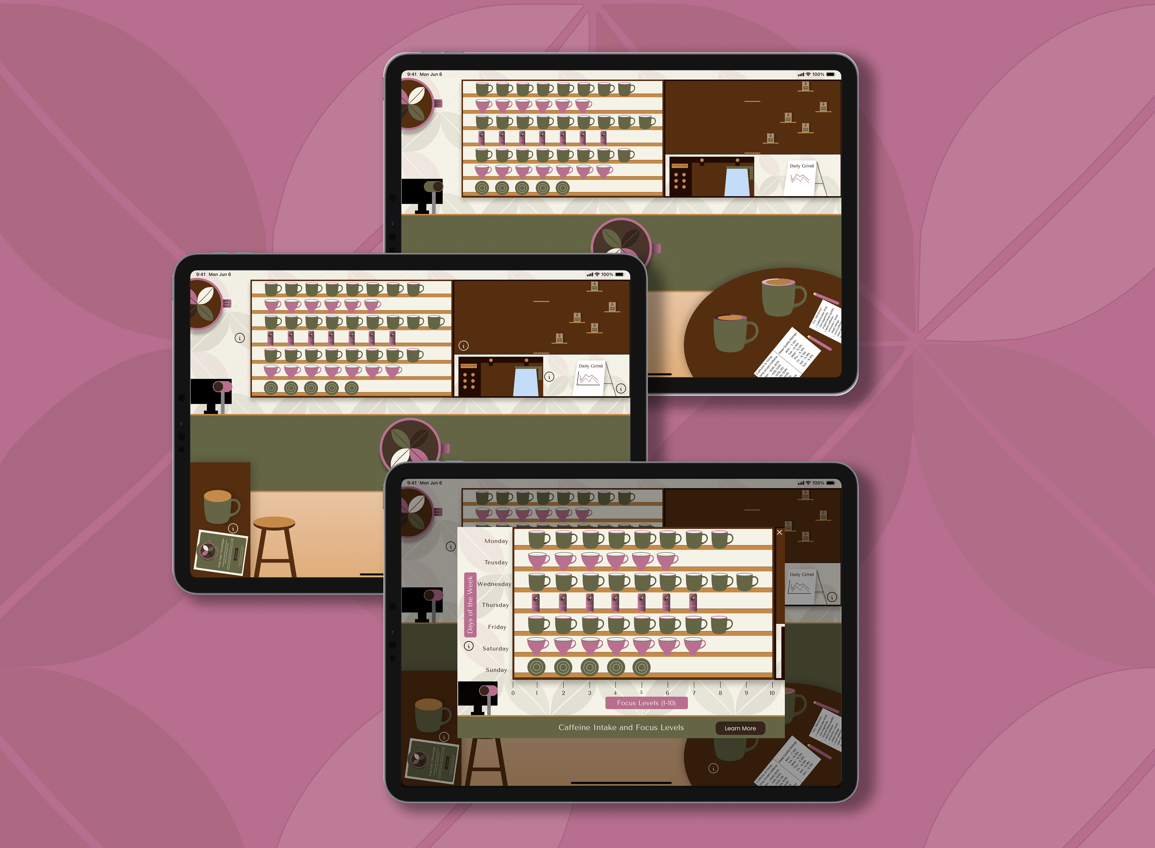
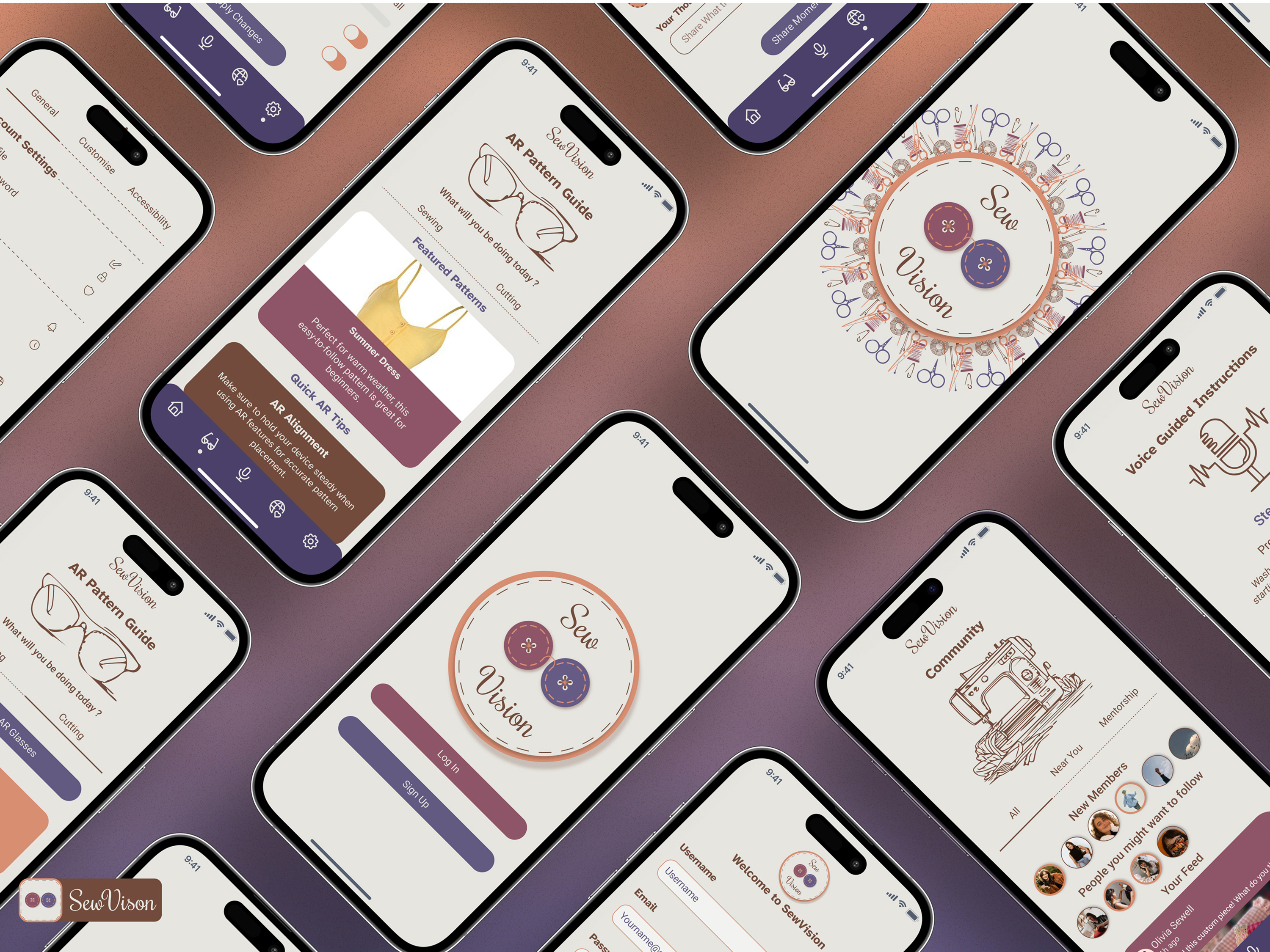
Prototypes